How Does a Color of the Year Get Chosen?
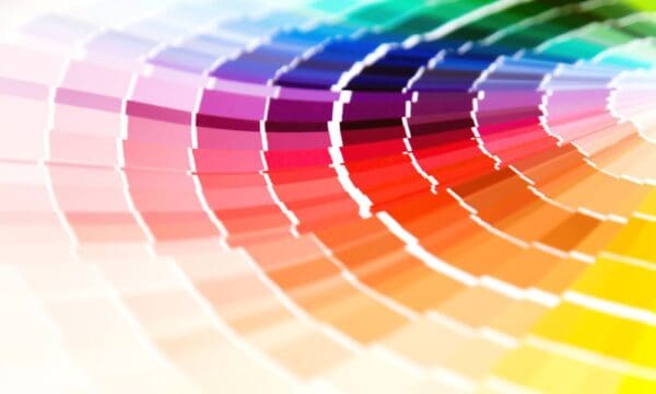
Have y’all ever swiped through your feed and discovered a post celebrating next year’s trendy color and thought, “How does a Color of the Year get chosen?” Me, too, y’all—me, too! I always wondered if it was chosen by a covert team on a secret island somewhere, but really, people pick it from a conference room halfway across the world. Here is what I’ve learned about how a company chooses next year’s popular paint color.
A Criterion Is Considered
They start by crafting a criterion. Trends, pop culture, current, and past paint trends, fashion, marketing, and political trends all contribute to the set standards. I was surprised, too—politicians influencing paint trends? Say it ain’t so, y’all!
With these trends in mind, analysts come together at a secret location to discuss what colors might work. Before they leave their meeting, they vote on the next year’s color.
There is a lot of debate over what palettes suit each other best and what mood would fit the following year. For example, 2022’s was Very Peri—a beautiful purplish blue showcasing a joyous presence. This was chosen to convey that happier times were coming in 2022.
The Significance of Color Choice
Color choice is significant in every way. We pick a favorite for more than just how it looks; I like lavender haze because it brings me peace of mind after a long day of work. Pantone bases their choices on moods, market trends, and even world events.
There is much more to paint color trends than you might believe. So many of the colors Pantone and other paint brands have chosen in the following years were generally centered around the decade, world event, or current pop culture.
I have sat here and marveled at the change in paint trends over the years, and I never stopped thinking about what influences paint trends. Things as small as a celebrity’s influential dress color to as significant as global changes can determine which color comes next.
Pantone’s Color for 2023
Pantone is a company I love watching to see what they release next. I really like the way they announce their choice; for 2022, they announced Very Peri by posting a photo of an art gallery. That was a surefire way to get me excited for 2023’s Color of the Year: Viva Magenta.
Viva Magenta is a lively mix of purple and pink. This color wants us to think about our current global culture and engage with each other to find answers to complex questions. I think it’s incredible how the Color of the Year is chosen! I cannot wait to see what you and I create using this rich tone in 2023.
Similar Posts:
- None Found
